McPiper Website Review
Last week I switched to doing 50% dev work and 50% marketing for my products. That’s one week for dev work and one week marketing the product.
Currently, most of my focus goes to McPiper as I work to add support for GitHub and other CI/CD systems. So I decided to spend the first marketing week on improving the McPiper website.
Indie products marketing
No doubt marketing is an important part of any product. But for indie products and side projects, it’s usually left as an afterthought.
Marketing and sales don’t feel natural to the developers. Most developers I know don’t like to think about sales at all. From what I understand - it’s because they don’t practice it. If you start any activity it will be uncomfortable at first.
Plus marketing is less certain than coding.
When you code - you know the code follows some steps, steps you wrote down. Yes, there are bugs, sometimes nasty ones, and code might not be ideal, but it will work and you know the path from an idea to the final code that runs that idea.
With marketing, it’s not so straightforward. First, you don’t know if the target audience is correct. You also need to nail down the copy on marketing pages. If you want to advertise - it’s also looking more like magic than actual science. Which assets to choose, how to combine these assets with the copy. Or, if you do inbound marketing and focus on blog posts, then results will only be visible a long time away. Even if you do most of the things correctly, still there is no guarantee it will pay off.
But marketing is a positive multiplier for the effort you do. For good product, good marketing can bring good money. Even for the bad product good marketing and sales can generate money. The worst is when you have a good product, but no-one knows about it.
Banner Bear journey to $10k in MRR has a great idea - doing 1 week of coding and then 1 week of marketing. It’s a great antidote to having head down and focus on coding. Separation of working on product and marketing it can push you outside your comfort zone.
Last week I did marketing for McPiper, and I started with the landing page review. If I bring traffic to the website at least it will look presentable to others. There were lots of things to improve.
Above the fold
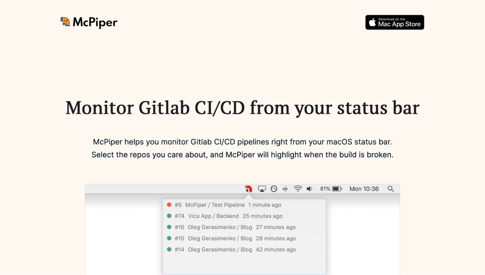
The most important part of a marketing website is above the fold area. It’s the part which seen first when you load the page. Right then the visitor needs to understand what’s the page is about. You need to convince the user to keep scrolling.
On the desktop, it wasn’t too bad. The screenshot, title and tagline were visible. The copy requires some changes as the tagline is too long. Plus the tagline doesn’t address the need of why care about this product, what problem does it solve.
The mobile view was bad. Logos are overlapping, the text is too big, and tagline almost isn’t visible.
Content
As mentioned above, the tagline needs improvement, but it might take a few takes to get it right.
The feature list is just a list. It was enough for the initial launch, so at least there is some sign of what’s included. But this needs improvement too, each item needs more copy.
For me, this is the most energy-sucking activity. You list things included in the product. Why would you need to add anything else? This should be self-explanatory, why would you need to describe what “notification” is. This is one of the reasons I haven’t solved this issue last week. Reflecting back on this - I should have delegated it to someone who can do it and who actually enjoys doing it.
Content-wise the footer is actually good. You can navigate the website, and the most important links are there. Footers aren’t required, but websites without footers look dodgy. The website without footer looks incomplete.
Finally, the website didn’t have frequently asked questions. I received a few questions during the first rounds on promoting the product, so it made sense to include them. I will move some of them to the main landing page as FAQs help sell the product as they lower the barrier to buy the product. Users have fewer things to guess if it’s already answered straight away.
Speed
Speed-wise it was ok, but there were low hanging fruits to improve the speed.
One of the fonts was loaded from the website. The font loading was taking a few 100 ms, and delegating it to another platform which can handle it better than I can be a good idea. The font is now loaded from Google Fonts.
The image was already optimised, so there was not much to improve.
Caching was the most important part of improving speed. By default, it was only cached for 4 hours. But since I invalidate cache on the servers every time I deploy a new version of the website it made sense to increase caching to 30 days.
Social
This was the worst area of it all. When someone shares the link to McPiper the first thing the receiver would see some default image. Even with OpenGraph tags on the page neither Twitter nor Slack pulls other images from the page. You have to mention the URL which you want to display on social sites.

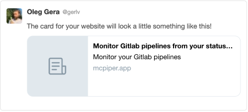
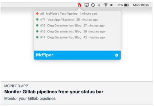
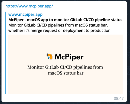
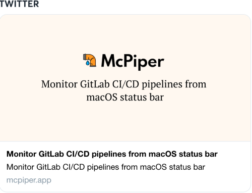
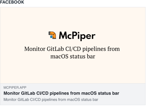
Mistakes were made. Half of the content in the image is lost.
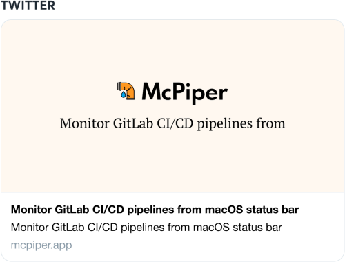
Even now the copy isn’t ideal, it’s too repetitive, but I will improve it with time.
If you read this far checkout McPiper and follow me on Twitter.